Mayday.Earth is a nonprofit organization dedicated to raising awareness and fostering informed dialogue around solar geoengineering, a complex and often misunderstood topic. Heyday Studios was engaged to develop a visual identity that would convey urgency, action, and education while remaining inclusive and accessible.
I led the project from initial brand strategy through final brand guidelines and implementation. I facilitated a collaborative strategy session with key stakeholders in order to define the organization's core values, which include climate equity, education, agency, urgency, and inclusion. I translated these values into the creative direction and visual identity, presented concepts to stakeholders, managed client communication and timelines, and guided the work through refinement and final delivery. Along the way, I also directed and reviewed supporting design work by Chia Ma, delegating components while maintaining the overall creative direction.
The responsive logo system uses megaphone imagery to communicate urgency and collective action. The wordmark is integrated into the logo as if the message “Mayday Earth” is being amplified outward, while a subtle Earth graphic reinforces the global scope of the organization’s mission.
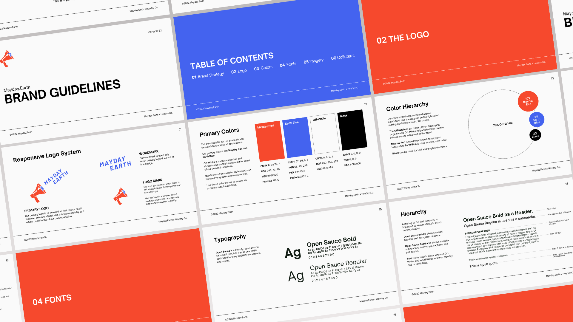
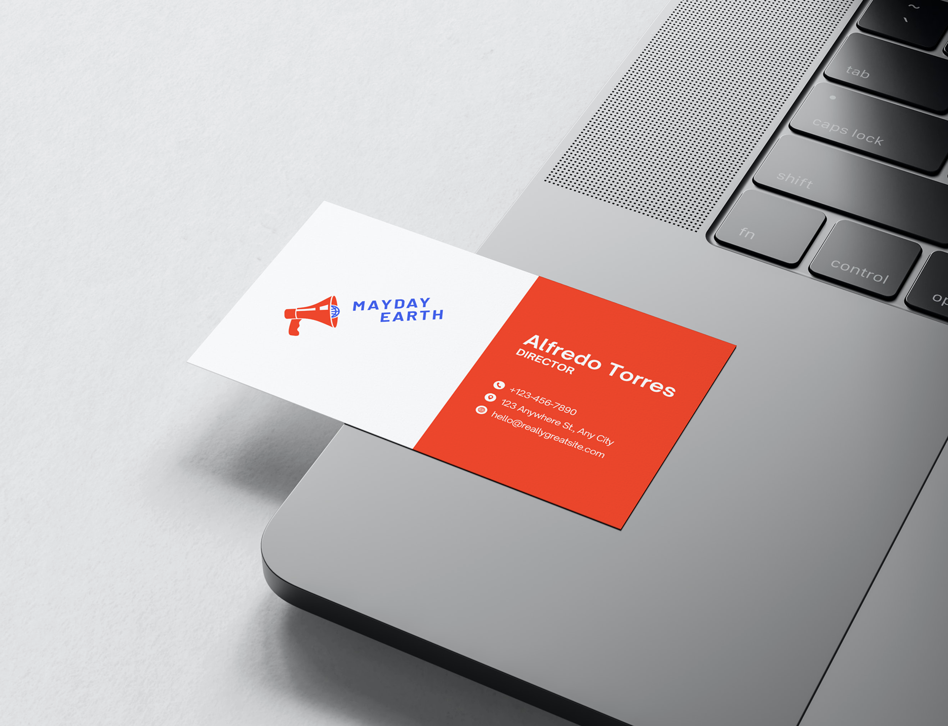
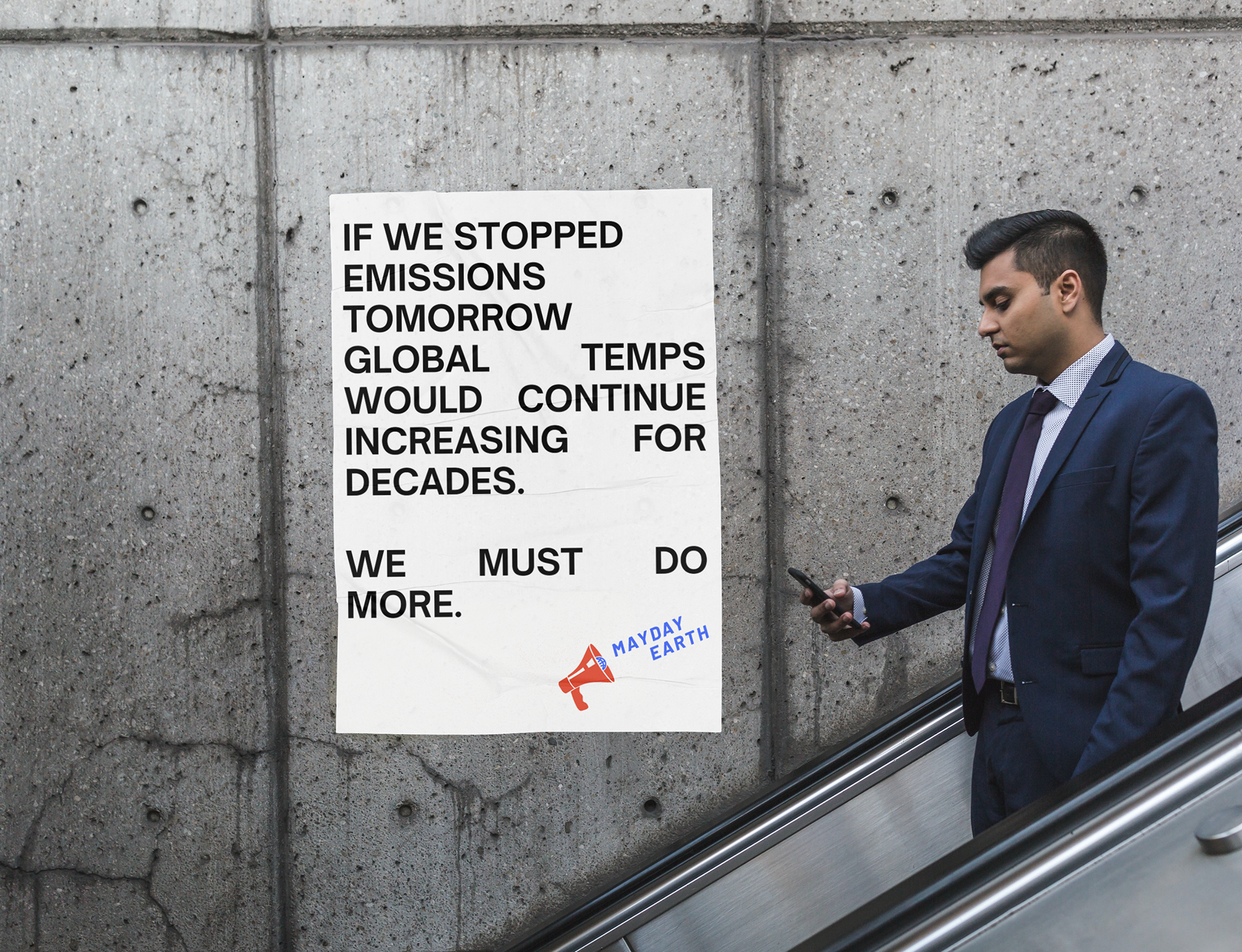
The resulting brand system includes typography standards, a color palette, marketing collateral, digital assets, and comprehensive brand guidelines. The final system was designed to be flexible and scalable across educational materials, campaigns, and outreach initiatives, giving Mayday.Earth a cohesive visual foundation as the organization grows.
My Role
Lead Designer
- Brand Strategy
- Creative Direction
- Identity Design
- Team Leadership
- Client Management
- Brand Strategy
- Creative Direction
- Identity Design
- Team Leadership
- Client Management
Collaborators
Chia Ma, Designer